By Kevin Norr
Senior Instructional Designer and Project Lead
As an instructional designer, I’ve reviewed many presentations by facilitators who clearly understood their content but had given little thought to how to communicate it visually to their audience. The fact is, presentations are a largely visual medium. Without carefully designed slides, we miss opportunities to communicate our messages most effectively.
Here are five guidelines to improve the visual design of your next presentation and positively impact learning for your audience.
1. Chunk Your Information
Most of us have been guilty of creating slides that include long lists of bullet points we feel are too important to leave out. The result can look text-heavy and busy, and be hard to understand.
Try “chunking” your information into groups of text to present it in a clearer, more effective way that maximizes learning. By organizing your information into smaller categories, you’ll make it easier for learners to scan the details, comprehend the information, and remember it. Take a look at the examples here to see what I mean.
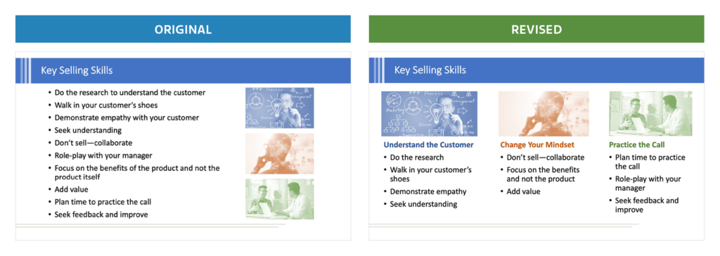
The problem: In the original slide, we see a lengthy list that floods the learner with information, making it difficult to process.
The solution: In the revised version, the material is organized into three categories that are each clearly labeled. The images help reinforce these “chunked” categories, rather than simply decorate the slide. As a result of these changes, the information is easier to understand and remember.
2. Connect Text to Images
In most cases, we use text as the primary means of providing information, while we use images to convey additional meaning and give context. Unfortunately, if we don’t link our text to the images, we can confuse our audience—or at least interfere with their learning.
Think strategically about how you organize the information on your slide. Place text next to corresponding parts of the image. Take a look at the examples below.
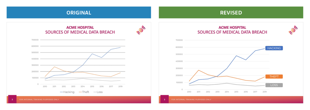
The problem: In the first slide, the chart’s key is placed at the bottom, forcing the audience to match the color of each line to the key below.
The solution: By including the text labels next to each line, the revised slide enables the audience to immediately see that “hacking” represents an increasingly costly threat to the hospital.
Here’s another set of examples.
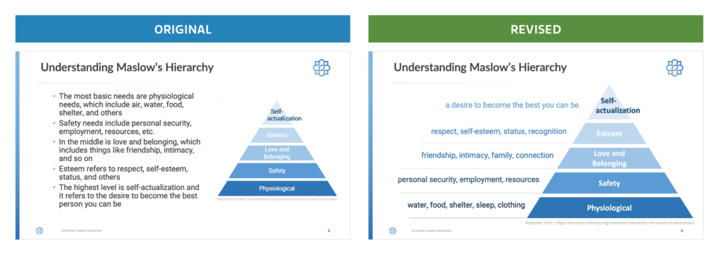
The problem: Note how text-heavy the original slide is. What’s more, the connection between the graphic and text isn’t clear.
The solution: In the revised version, the text is placed next to the hierarchy level it describes and the color of the text matches each part of the pyramid. As a result, the audience doesn’t need to scan back and forth to connect the description of each category in the pyramid.
3. Select Relevant Images
Most of us would agree that presentations would be pretty dry without images. But you may not realize that a non-relevant image risks distracting learners from the text on the screen.
A highly relevant and informative image, on the other hand, helps the audience to process and comprehend the information more quickly. Consider the examples below.
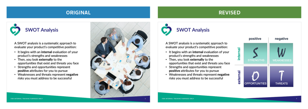
The problem: Note that both slides include the same text. However, the non-relevant image in the original does nothing to improve our understanding of what a SWOT analysis is or how to conduct one.
The solution: In the revised version, the diagram complements the text by explaining what we mean by the acronym “SWOT” as well as by visually reinforcing the categories—like internal and external—associated with each part of the analysis.
4. Remember That Less Is More
Take a moment to reflect on your own experiences as a learner. How many times have you watched a facilitator show slides containing paragraphs of information and way too much detail? It was overwhelming, right?
We should all keep in mind a cardinal rule of communication: Less is more. Each slide you create should provide a limited amount of information organized in the most effective way. If you find you have too much text on a slide, consider reorganizing the information into multiple slides that will better enable you to emphasize individual points.
And, whenever possible, remove text you don’t need. Your learners don’t want to read entire paragraphs, so just give them the highlights and then vocally fill in the rest during the presentation. Take a look at the examples below to see what I mean.
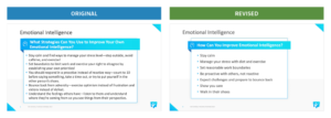
The problem: Note how the original slide provides unnecessary details and uses complete sentences. The designer even had to reduce the font to fit in all the text.
The solution: The revised slide presents nearly the same material but does so more succinctly and clearly. As a result, the audience can quickly process it as the facilitator expands on key points.
5. Create Impact Slides
The last tip I want to share with you is something I focused on in my blog Less Is More: Using Impact Slides to Improve Your Next Presentation. In that post, I reviewed ways to create impact slides by cutting down on text and using strong images to both communicate information and focus the learner’s attention. Impact slides are especially great for teeing up a story or using a metaphor to convey a lot of meaning with limited text, as in the revised slide below.
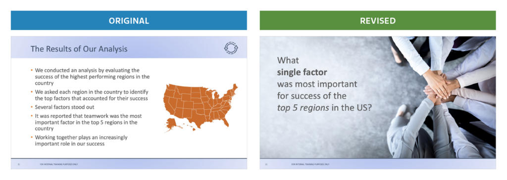
The problem: Looking at the original slide, you may not even realize the facilitator’s main point is that teamwork is the most crucial factor associated with high-performing teams. In fact, the word “teamwork” is buried more than halfway down the text list.
The solution: The impact slide tees up the question and uses a powerful image to imply the answer, without ever using the word teamwork directly. By inviting the audience to guess the answer, the slide better catches their attention and drives engagement. As a result, audience members are more likely to remember the main point of this slide—once the facilitator confirms it—than the slide with too much detail.
So the next time you find yourself preparing a presentation, take a moment to consider the five guidelines covered here. You—and your audience—will be glad you did!
________
Kevin Norr is an accomplished education and training professional who brings more than 20 years of experience in designing electronic and in-person courses to Encompass. His experience spans a host of industries, including pharmaceutical sales, aerospace, transportation and shipping, leadership training, financial services, telecommunications, nonprofit organizations, and manufacturing. Kevin earned a PhD in industrial/organizational psychology from Auburn University. He has served as a professor at the University of North Carolina Wilmington for over 10 years, creating and teaching online courses in industrial psychology to advanced undergraduate students.


